


COVID-19 Datapothecary
Processing observation level data for more reliable calculated metrics


Wrong can go very wrong very easily
There's a running joke in machine learning circles that data wrangling is 10% skill and 90% anger management. While that's funny because it's true, in the case of health care data the consequences can be deadly serious. In California, problems with reporting likely and confirmed COVID-19 deaths in the early months of the outbreak hampered the ability to effectively respond, and still impacts the usability of that early data to this day. And then there are the changes and restatements that are specific to COVID-19, such as splitting out ICU availability to exclude infant units from the count. It's in the service of making data more usable, but it still adds some incidental complications to any analytics process. So the data will continue to grow, change and beg for correction as the pandemic looms on. Even with worldwide attention on the data - seemingly innocuous errors and mistakes can ripple though calculations that weaken and sometimes cripple insight. But with the right tools and experience those issues can be managed and corrected. This entry demonstrates a few cases of how ailing data can be made well again.
When the Bargain is no Bargain
It's convenient to start with a fully prepared data set from a public source. It both allows deriving visuals quickly and benefits from "objective" sourcing - a form of collaborative/peer review. That's why I started with Our World In Data COVID-19 data. Beyond raw daily observations it also had aggregates (running totals) and population-leveled values (x incidents per million). But early on I saw some problem "features" in the shape of the data...
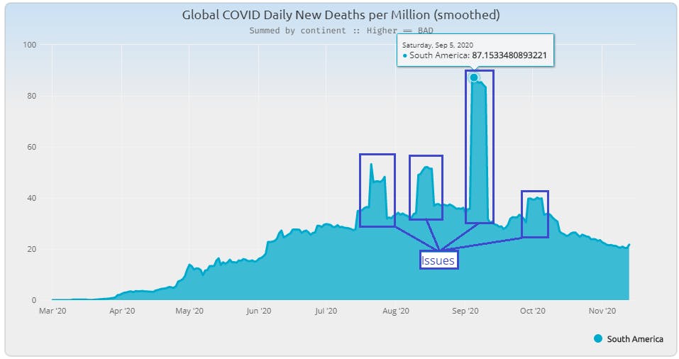
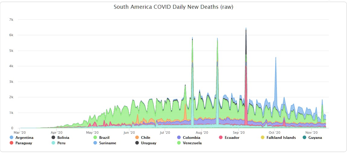
I immediately recognized an issue I've seen over the years - terracing of a 7-day average due to an outlying value pulling up/down a week-long range. Sometimes it appears as a "cut-out" of the data as a zero or negative value pops into an otherwise consistent series of data. In this case they seem to pop out like land features at Monument Valley. When you back up and look at the observation data, the problems appear clearly.
This actually showed two issues:
- Some base observations needed adjusting, and
- All calculated columns (aggregates and population-leveled values) would need to be re-calculated.
This is the first phase of anger management in data wrangling - when you find a symptom of a broader problem that causes a fan-out of work required to shape the data into a more usable form. Because bad observation data infected the rolling mean and other pre-calc'd series then all generated columns from OWID have to be ignored and re-calculated in my project.
Part 1: Zapping outliers
There are re-sampling methods that can scrub bad values but here I started by directly replacing a few entries to see what else popped up. Going too early with programmatic interventions on unfamiliar data can have unseen negative consequences. Going full retail line-by-line would show me whether a programmatic intervention was warranted. Here's the code for substituting those out-of-bound values.
  mutate(new_cases = ifelse((date == "2020-07-18" &
                                location == "Chile" &
                                new_cases == 1057),
                             57,
                             new_cases)) |>
  mutate(new_cases = ifelse((date == "2020-07-24" &
                                location == "Peru" &
                                new_cases == 3887),
                             87,
                             new_cases)) |>
  mutate(new_cases = ifelse((date == "2020-08-14" &
                                location == "Peru" &
                                new_cases == 3935),
                             335,
                             new_cases)) |>
  mutate(new_cases = ifelse((date == "2020-09-07" &
                                location == "Ecuador" &
                                new_cases == 3800),
                             38,
                             new_cases)) |>
  mutate(new_cases = ifelse((date == "2020-09-07" &
                                location == "Bolivia" &
                                new_cases == 1610),
                             161,
                             new_cases)) |>
  mutate(new_cases = ifelse((date == "2020-10-02" &
                                location == "Argentina" &
                                new_cases == 3351),
                            351,
                            new_cases)) |>
  mutate(new_cases = ifelse((date == "2020-10-09" &
                                location == "Ecuador" &
                                new_cases == 398),
                            39,
                            new_cases)) |>
Essentially I'm doing by eye what a sampling algorithm might do. I look for out-sized values and adjust each one down to fit relatively closely to the range on either side of the offending data point. Since the rolling mean calculation will provide further smoothing, I knew I didn't have to be too precious about it. I just had to take care of what looked like obvious flubs in data entry.
This over-targeted approach has two positive side-effects. First, anyone who re-produces my chart will know exactly what's substituted (and comment out what they don't wish to keep). Adding the selection for the offending value means any code reviewer can see in code what's being picked and replaced. And second, if there's a restatement of those values then the selection will fall out and the new value from restated source data will be taken. I don't think that's particularly likely, but it's a safety to revert to source data if it's ever corrected.
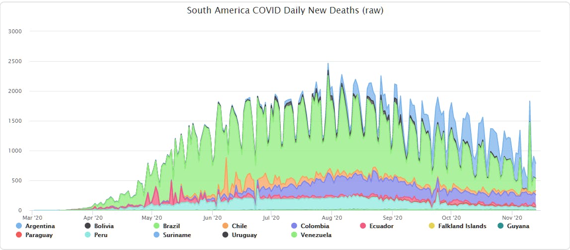
So with that I had a range appropriate observation set that would yield more usable processed values. Even though the shape makes the trend look larger it's actually due to the re-scaled Y-axis revealing more of the data - a positive result of removing the odd/offending values.
Part 2: Re-calculating rolling mean
Most public COVID-19 reports show some form of smoothed data. It's commonly referred to as "running average" and similar terms. The purpose is to take the "natural chop" of reporting cadence due to weekend under-reporting (and the over-reporting on the following weekdays) and make it more readable. It can blunt some sharp increases when the number of look-ahead days is limited, but there are ways of dealing with that.
Here we'll take an academic side-bar to look a the math and how it's applied in R. The formula for "simple mean" calculation - takes the the wiggle out of the individual measures while preserving the overall trajectory of the data.
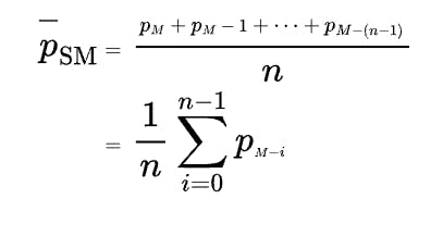
And while it can seem a bit intimidating on the surface, the logic is - as the name implies - simple. The calculation uses values ahead and behind in the current series to create an average value. And within R there's a slider library that piggy-backs on tidyverse conventions to produce this function with just a few parameters.
mutate(ncrm = slider::slide_dbl(new_cases, mean, .before = 3, .after = 3))
Note how the function call slide_dbl takes the input column, then the function to apply and the number of values to look ahead and look behind. That calculates the rolling mean value for the newly generated column. Again, like most tidyverse libraries and functions there's a way to achieve this in base R, but readability of tidyverse code makes it worth the switch to an even more concise DSL-like pattern.
Part 3: Population-leveling
When looking at COVID-19 reports online you'll find various metrics that are population-leveled to make comparisons between regions more reasonable. Depending on the scale of the data, baselines of one thousand, one hundred thousand and one million are sometimes used. Since OWID data sums into the billions, the one million factor is used.
$$(\frac{count}{population})\times{1,000,000}$$
The formula is easy to comprehend but there are some fan-out issues when changing scale of the region comparisons. The OWID data set had per million values for various metrics, but they're tied to the country level. And you can't just add those population-leveled values, and I'll give an example that shows why that's the case - something I found while inspecting the data set that's a perfect example of how order-of-operations for calculated metrics is not always intuitive.
Example: Outsized Influence of the Holy See
I was scouting for more out-of-band values in the data and found some eye-popping numbers for new cases per million. When I saw that The Vatican had values well over 8,000 I assumed something had to be amiss. So I went to the raw data...
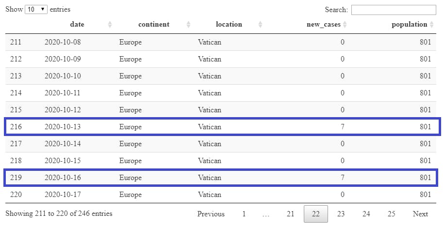
...and saw that the math actually checks out.
$$(\frac{7}{801})\times{1,000,000} = {8,739.07}$$
And while it's correct, it's not particularly useful. This is a common feature of these types of leveling functions which operate more rationally when comparing similarly scaled data. So when wanting to look at all of Europe's data with population leveling against other continents the process is to aggregate the population and counts at the location level before producing a new continent-scoped value.
$$(\frac{97,925}{750,720,350})\times{1,000,000} = {130.44}$$
Taking the accumulated events and summed population for all of Europe for October 13 "folds" the Vatican data into the aggregates to produce the final leveled value. And this illustrates the point that even if the base observations were clean and correct that this process would still be needed for region-to-region comparison above the location level. That meant taking another step back to join in population data for each country/location. And the next mini-adventure begins...
Part 4: Population data
Bringing in population data opens the door for driving more insights from the raw OWID data. In most public geo-related data there's a column for tying the data to other data sets. I found this document with 2020 population data, which is a great starting point. But the bad news is that it didn't have the expected ISO codes for tying the countries listed in the population data back to the OWID data. So I "cheated" and simply mapped the "country" column names such that they matched the location names. It started with change "&" to "and" and substituting accented values for American standard replacements.
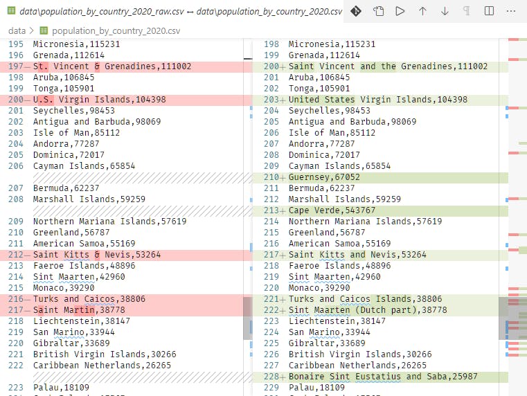
This turned into another mini-project, as the population list was incomplete. Mainly small island and similar locations were missing, but there were a few head-scratchers. So I went online and looked up values to fill out the record set. This is where it's possible to get stuck on "a distinction without a difference" since getting the population exactly right isn't the point. It's about maintaining the ratio in comparison to similarly scoped regions. That said, the Vatican example is a reminder that when the population size is small (such as the islands and other locations added) that tiny differences can move a one-million-leveled value quite a bit. But once the new values were calculated and aggregated I saw a workable result.
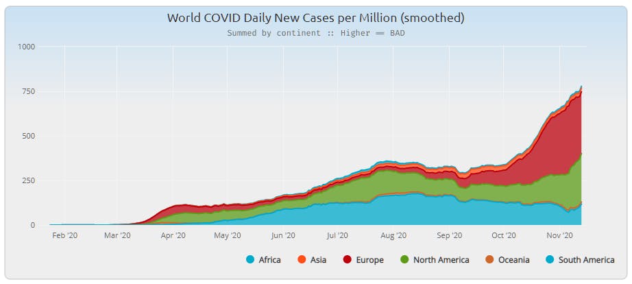
Looking at the "South America" portion of this report the smoothing definitely allows the viewer to get a better sense of what was happening globally.
Toward a more curated result
There's a saying that art is never finished, just abandoned. The same can be said for data projects. There's always more to learn, more to do, and more insight that can be gained. But for now I'll let the global data rest and turn my attention to US and California data. When I come back to this I'll add iso-a3 codes to the curated population data and make it available for others to use. And it will go toward the good faith effort to create projects that are repeatable and hopefully encourage others to use and share the data for continued and expanded research.